MOMA NAKAGIN GRAPHICS KEEP TWO LANGUAGES TOGETHER
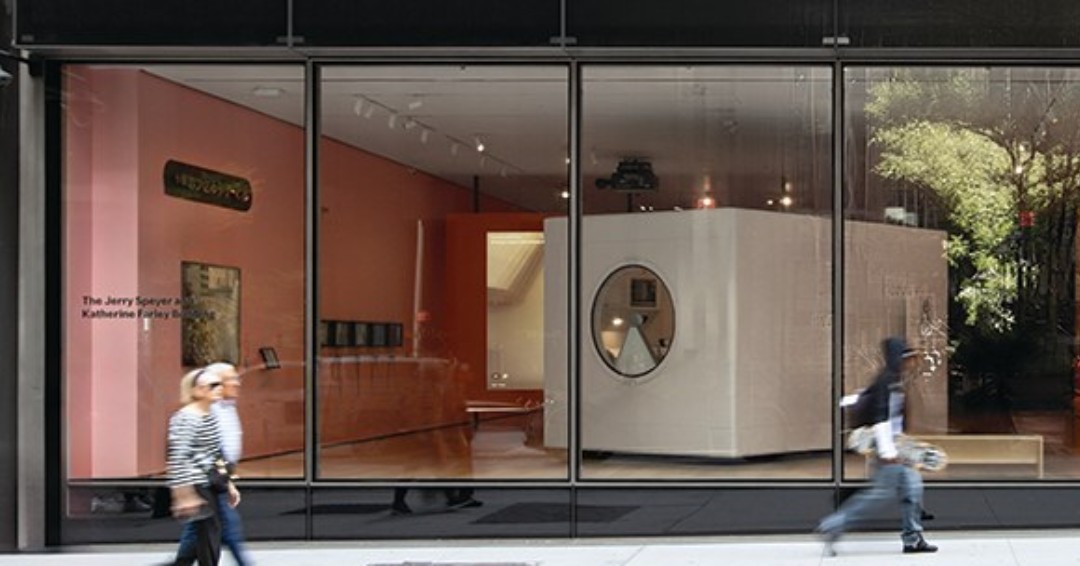
Communication Arts recognised MoMA Design Studio’s graphics for The Many Lives of the Nakagin Capsule Tower. Rounded typography balances English and Japanese across the identity for the exhibition, which closed July 12, 2026.
Key Points
- Communication Arts credits MoMA Design Studio.
- The identity balances English and Japanese typography.
- The exhibition ran July 10, 2025, to July 12, 2026.
MoMA Nakagin Capsule Tower graphics have received Communication Arts recognition, bringing the museum's bilingual exhibition identity back into view after the show closed. The September 25 post credits MoMA Design Studio for typography inspired by the capsule itself, with English and Japanese given space within shared compositions.
The distinction in timing matters. The Many Lives of the Nakagin Capsule Tower ran from July 10, 2025, to July 12, 2026. The current announcement recognises the completed graphic design that accompanied the restored capsule and its exhibition materials.
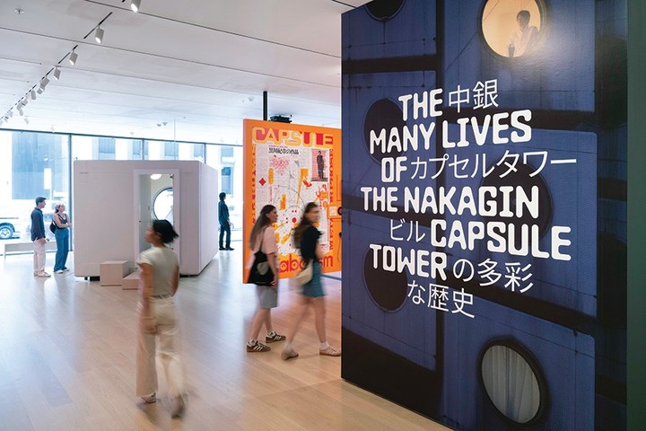
The pictured materials use rounded letterforms, dark blue panels and pink grounds around a building whose circular windows are among its most recognisable features. The type borrows that rounded vocabulary without turning every letter into a literal drawing of the tower.
English and Japanese Share the Composition
MoMA Design Studio's statement says the identity balances English and Japanese as a reference to the building's origin. The photographed panels place both scripts within one visual system instead of leaving one language as a detached caption below the other.
That decision gives the text more than a translating role. The different letter shapes create related blocks of information, with changes in size and spacing helping the viewer move between them. The English curves and the more compact Japanese forms share a panel without becoming visually identical.
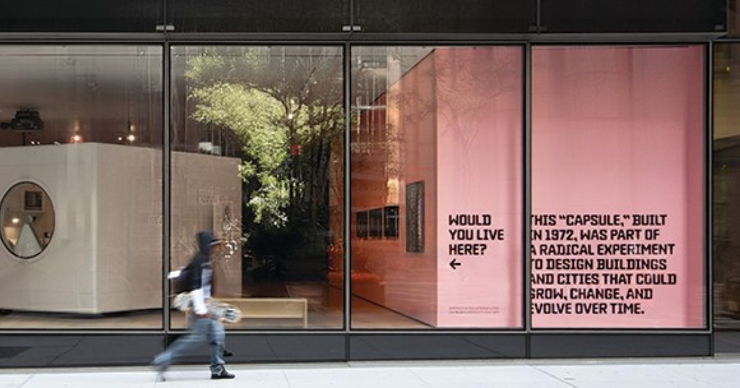
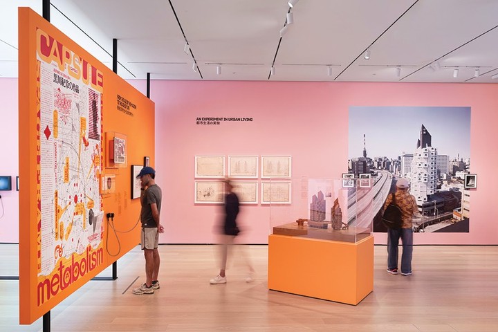
The dark blue ground adds a firm boundary around some of those arrangements. Pink appears elsewhere in the exhibition materials, changing the mood while preserving the rounded type's identity. The system can therefore move between a wall, a printed object and an exterior invitation without relying on a single background colour.
The OJAS listening room in Tokyo offered another design encounter built around a highly particular interior. MoMA's graphics address a different task: giving a small architectural unit a public identity across several surfaces before and after a visitor reaches the object.
Capsule A1305 Anchored the Exhibition
MoMA centred the show on A1305, a restored capsule from the top floor of Kisho Kurokawa's Nakagin Capsule Tower. The original Tokyo building was completed in 1972 with 140 capsules and was demolished in 2022.
That specific unit gives the graphic reference a physical source. The rounded forms belong to a building whose windows and compact rooms were already distinct objects, with a circular window that remains visible in the exhibition photographs. The exhibition identity could draw from a capsule visitors were able to encounter at the museum.
The photographs of the materials make that relationship readable at different scales. A circular window is a large architectural opening; a rounded letter is a small mark on a panel. The resemblance links them without requiring the text to reproduce the building's complete shape.
MoMA's show also included drawings, models, photographs and film. The identity had to sit around that varied material as well as the capsule, making consistency across signs and printed pieces useful to the exhibition's overall presentation.
A Street Question Takes the Design Outside
One photographed application asks whether the viewer would live in the capsule, placing a direct question within the exhibition's rounded graphic language. The invitation carries the subject beyond the gallery wall and into a public facing format.
The question changes the reader's relationship to the object. A capsule can first appear as a recognisable architectural image; asking about living in it brings scale and daily use into that first encounter. The graphic does not need a floor plan to make that shift in attention.
Other small space stories, including Casa Tobi's coastal setting, also become clearer when a reader considers how a building is occupied. MoMA's application makes that consideration part of the first line someone sees, before the longer account of the tower's changing uses.
July's Closing Date Leaves a Design Record
The exhibition closed on July 12, 2026, according to MoMA's calendar. Communication Arts' later recognition concerns the Design Studio's completed work for that presentation.
The graphics remain available as a record of how the museum connected a restored capsule, two languages and several kinds of display surface. Their strongest details are visible in that record: rounded type, English and Japanese held together, and a direct question about living inside the object.
A1305 supplied the architectural centre of the exhibition. MoMA Design Studio's identity gave that small room a larger public presence, with bilingual panels and printed applications continuing to explain the project after the exhibition's physical run had ended.
Frequently Asked Questions
What did Communication Arts recognise?
MoMA Design Studio’s identity for The Many Lives of the Nakagin Capsule Tower.
Is the Nakagin exhibition still open at MoMA?
No. Its listed closing date was July 12, 2026.
What languages appear in the graphics?
English and Japanese share the compositions.
What inspired the typography?
The Design Studio says the letterforms draw inspiration from the capsule.
What capsule anchored the exhibition?
The restored top floor unit A1305.
Who designed the original Nakagin Capsule Tower?
Japanese architect Kisho Kurokawa; the Tokyo building was completed in 1972.
Topics: moma, nakagin-capsule-tower, kisho-kurokawa, graphic-design, typography, exhibition-design, communication-arts