JIL SANDER MAKES THE CRINKLES DELIBERATE
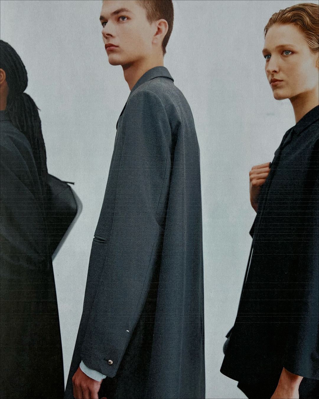
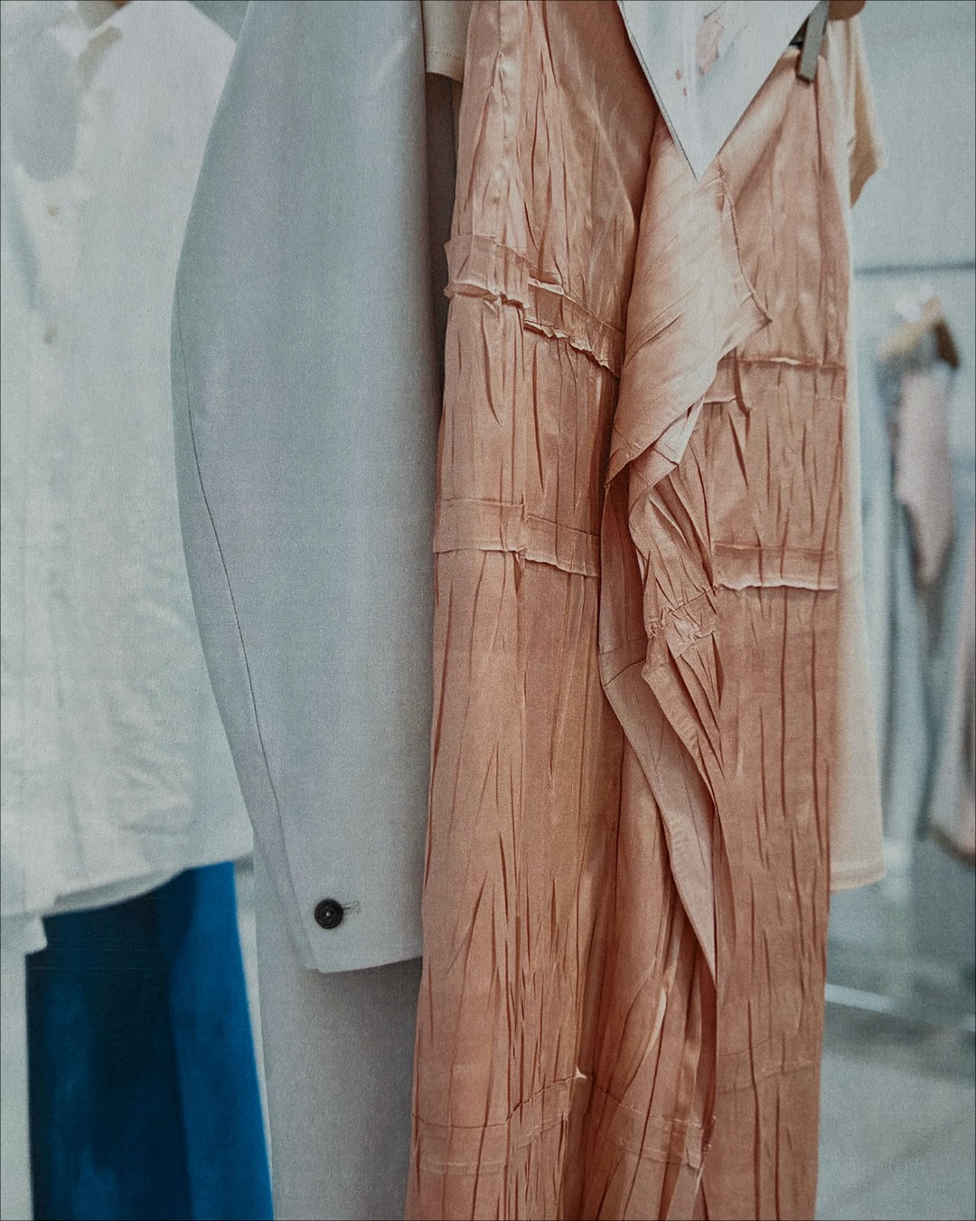
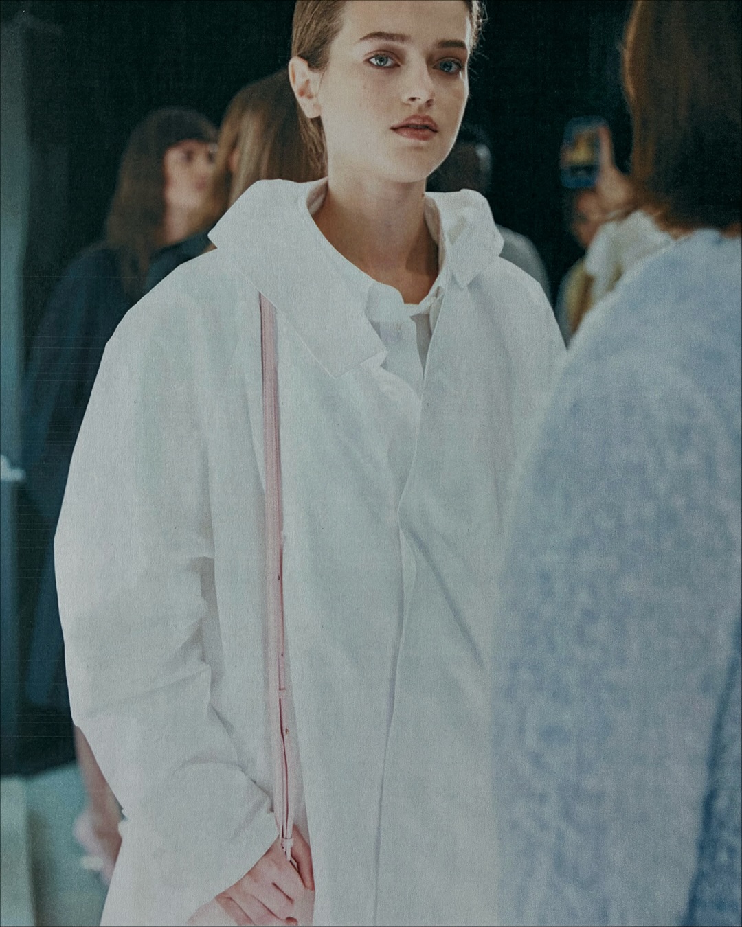
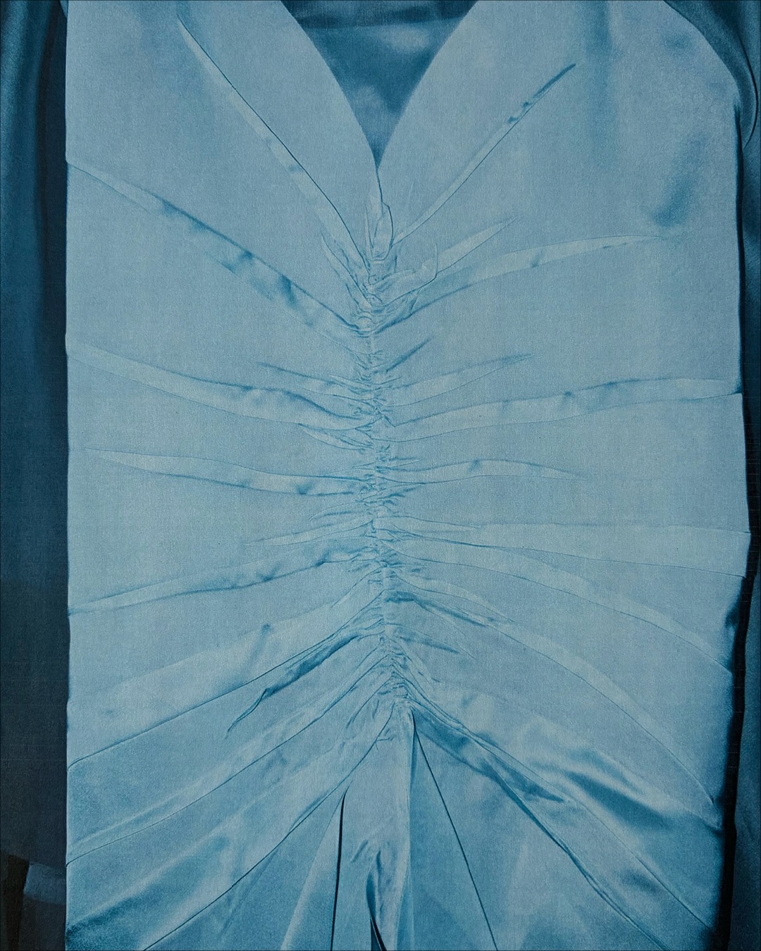
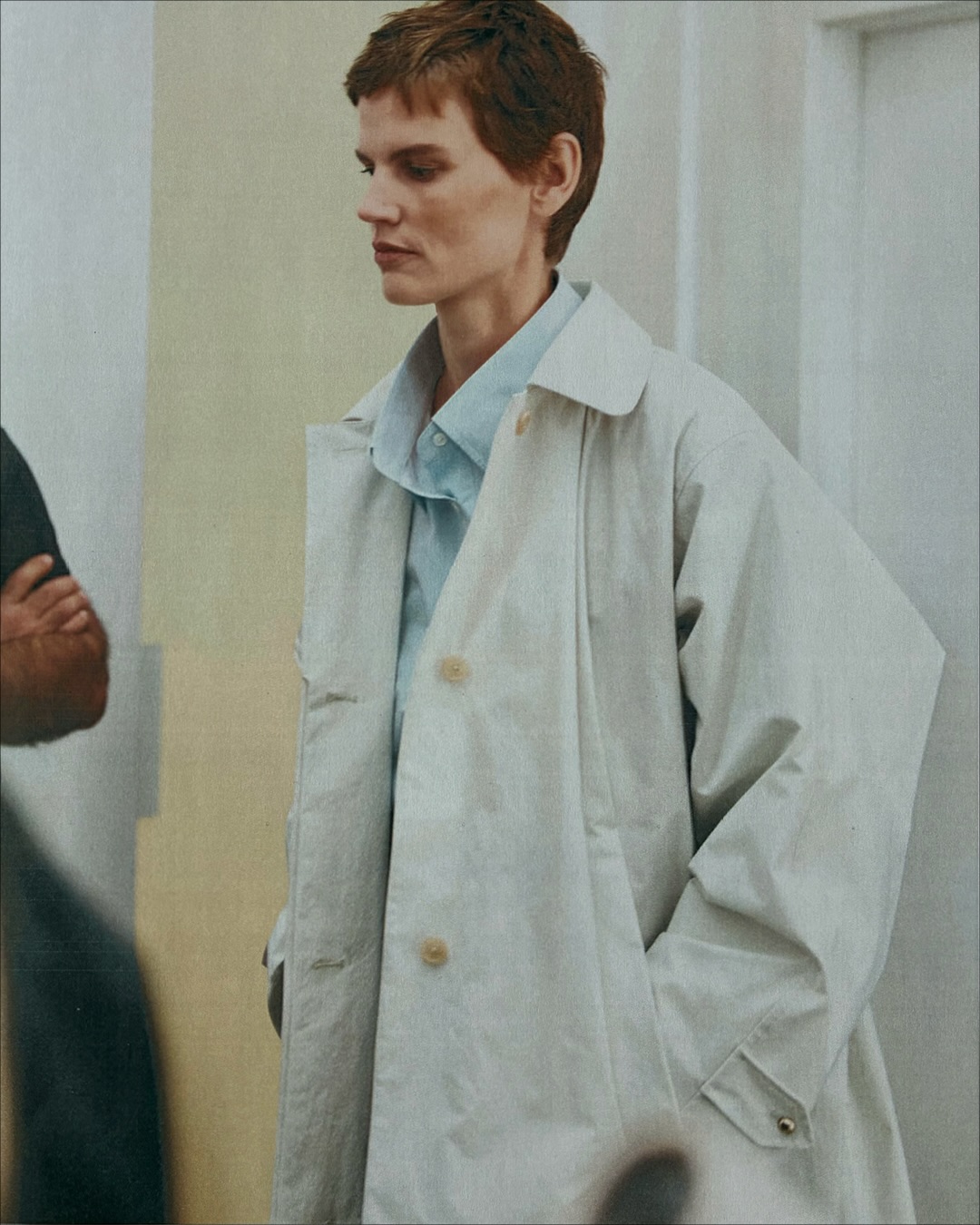
Jil Sander follows its Spring Summer 2027 show with Sarah Blais photographs focused on fabric and layering. The brand identifies precise pleats and deliberately crinkled surfaces, with pale shirts, tailoring and sheer layers visible in the images.
Key Points
- Sarah Blais is credited for the close photographs.
- The brand names pleats and intentional crinkles.
- The Spring Summer 2027 show took place September 23.
Jil Sander SS27 fabrics come into focus through Sarah Blais' photographs of the collection's pleats, crinkled surfaces and layered looks. The house's September 25 post describes those textures as deliberate construction choices, directing attention toward the cloth after the runway's wider view.
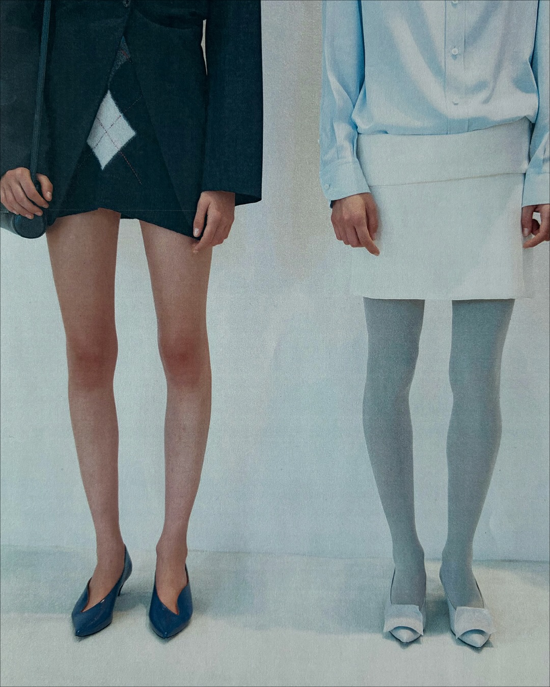
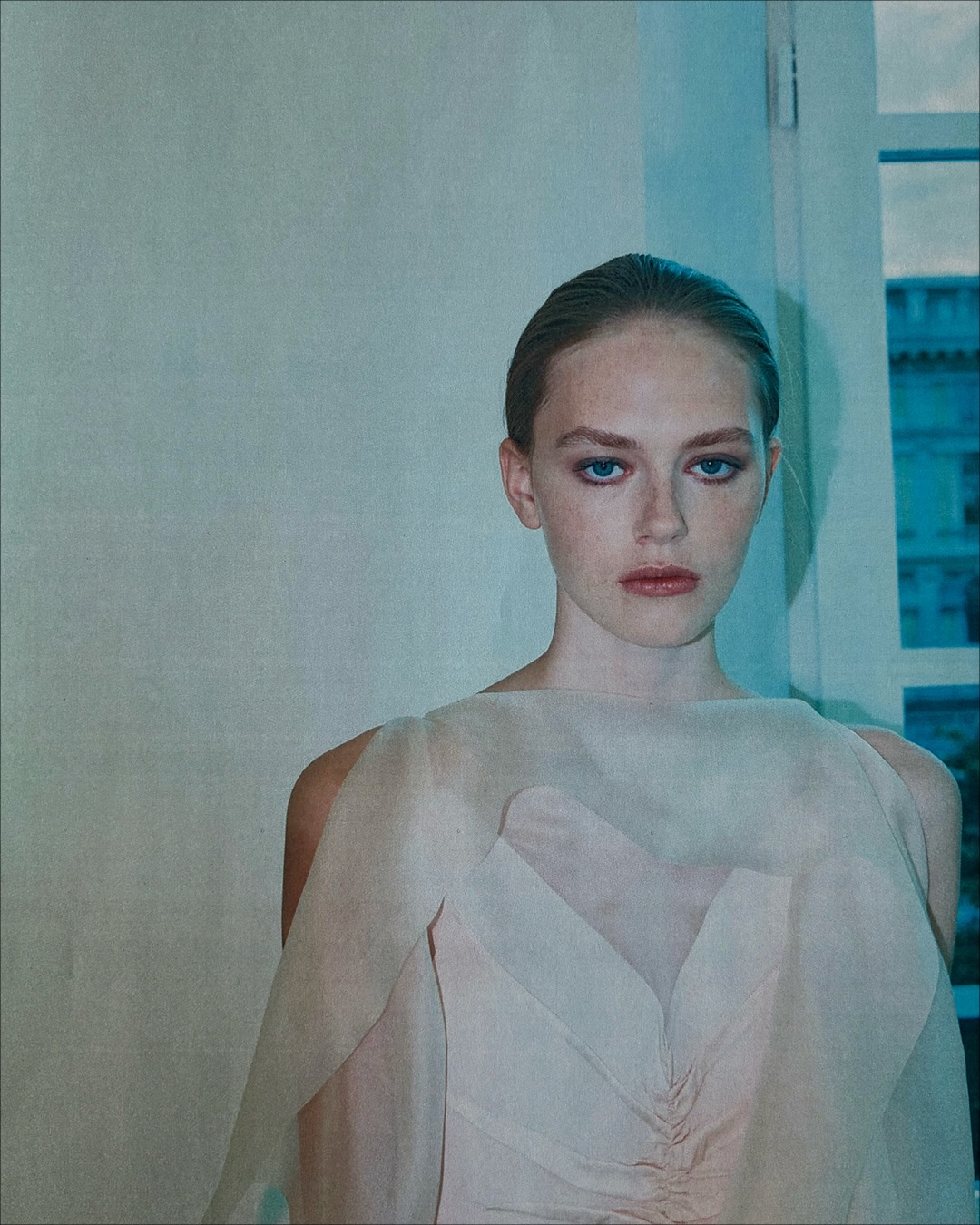
The opening portraits place dark tailoring beside pale shirts and sheer layers. One close view cuts the figures around the waist and legs, giving a white skirt, grey hosiery and pointed shoes as much presence as the upper garments. Another holds on a translucent pale layer over pink, making the overlap itself visible.
The Yohji Yamamoto hidden seam collection approached construction through the concealment of joins. Jil Sander's current post asks the viewer to notice another part of making: the surface of the fabric, including folds and crinkles that remain visible after the garment is complete.
Pleats and Crinkles Are Named Design Choices
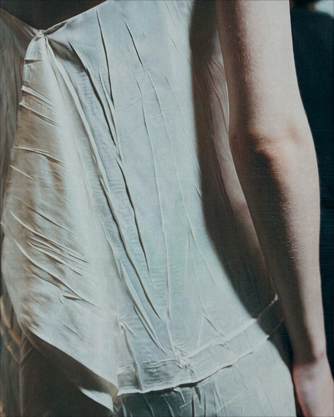
Jil Sander identifies precise pleats and deliberately crinkled surfaces in the Spring Summer 2027 collection. The wording establishes those irregularities as an intended finish that remains visible in the collection’s closer photographic presentation.
That distinction changes how a close view should be read. A regular pleat directs cloth into a repeated pattern, while a crinkled surface produces a less uniform field of small shadows. Both can remain visible within a garment whose overall outline looks restrained from farther away.
The photographs move between those scales. A portrait allows the jacket or shirt to register as a whole; a tighter crop directs attention to the surface and to the edge where one layer meets another. The post's emphasis on fabric gives those closer views a clear purpose.
The brand does not provide a fibre breakdown for every pictured look in the caption. Pleating and crinkling describe treatments and appearances, so they should not be turned into an unsupported claim that each surface uses an identical silk, cotton or synthetic fabric.
Pale Blue Meets White at the Waist
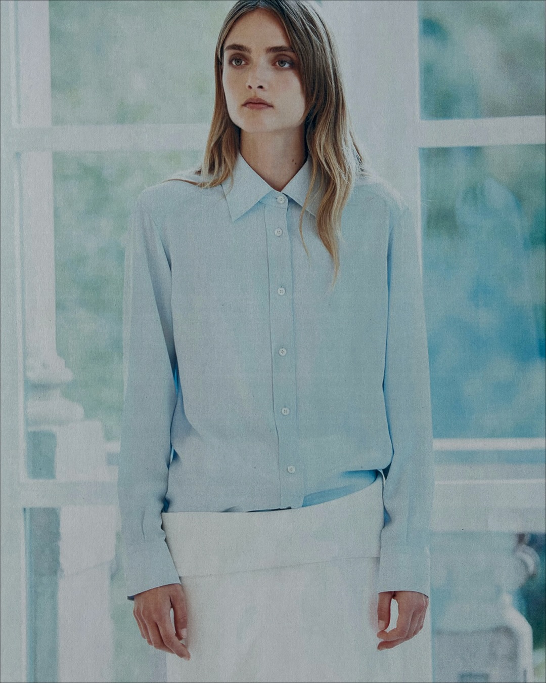
One photograph pairs a pale blue shirt with a white skirt, grey hosiery and pale pointed shoes. Beside it, a darker tailored look exposes the legs, creating two different divisions between clothing and skin within the paired frame.
The crop makes the waist and hem useful reference points. The blue shirt meets the skirt at a clear horizontal line, while the hosiery continues the pale sequence below it in a cooler grey. The pointed shoes close that vertical arrangement without adding a heavy dark base.
The neighbouring dark look has a different balance. Its broad upper shape sits above bare legs, so the garment's lower edge becomes especially conspicuous. The photograph can compare proportion without requiring either look to be isolated on a blank page.
That is the value of the paired view: colour, coverage and shape can be read together. The clothing remains distinct, but the shared crop makes the differences in length and layering easier to notice.
A Sheer Layer Softens the Pink Beneath
Another portrait shows a translucent pale layer over a pink garment. The outer fabric allows the underlying colour and neckline to remain visible, giving the image two surfaces to read at once.
The overlay changes the edge of the pink without hiding it completely. At the centre, the viewer can follow the shape below; nearer the shoulders and outer edges, the sheer fabric becomes the more visible boundary. The overlap gives the portrait its changing surface, with pale fabric softening the pink beneath it.
Prada's Fall Winter trench construction used capes and additional utility elements around a familiar coat. Jil Sander's photographed layering is lighter in appearance, but the comparison makes the role of an added surface clear: a garment can change when another layer modifies its outline and visibility.
Sarah Blais Keeps the Camera Close
Jil Sander credits Sarah Blais for the photographs in this fabric focused post. The official show was presented on September 23, with the closer material images following on September 25.
That sequence moves from the collection's public runway presentation to selected details. The new post does not announce that Spring Summer 2027 is already available at retail; it extends the visual record of the show through a different distance from the clothes.
The blue shirt and white skirt establish one clear arrangement, while the sheer layer over pink provides another. Pleats and intentional crinkles supply the caption's construction focus. Together, Blais' crops let fabric, overlap and the points where garments meet remain visible after the runway silhouettes have passed.
Frequently Asked Questions
What is the focus of Jil Sander’s new SS27 post?
Fabric surfaces, pleats, crinkles and construction details.
Who photographed the collection details?
Sarah Blais.
Is the crinkled finish intentional?
Yes. Jil Sander explicitly describes them as deliberate.
When was the Spring Summer 2027 show?
The official show listing gives September 23, 2026.
What layering appears in the photographs?
A translucent pale layer over pink is among the shown looks.
Does this post announce immediate retail availability?
No. It extends the visual record of the Spring Summer 2027 show.
Topics: jil-sander, ss27, sarah-blais, pleating, crinkled-fabric, tailoring, runway-details